From Zero Baseline to 15+ Direct Bookings
Converting a fragmented personal site into a sophisticated, high-conversion professional platform.

Homepage hero featuring live performance footage and primary booking call to action. Mobile view showcasing band arrangement grid.
The Problem: A client’s existing portfolio was built on a dated, non-responsive framework that failed to communicate professionally, and lacked a clear call to action resulting in zero new bookings.
The Fix: Redesigned the digital experience from the ground up, establishing a mobile-first design system in Figma and migrating to a high-performance Squarespace architecture.
The Result: Transformation drove an immediate increase in professional inquiries and new client bookings within the first month of launch.
Quick Summary
Role: Product & UX Designer
Tools: Squarespace, Figma, Google Docs
Timeline: ~6 weeks
Context: Client-facing marketing site, booking-focused redesign
The Strategy
Pivoting to Drive Conversion
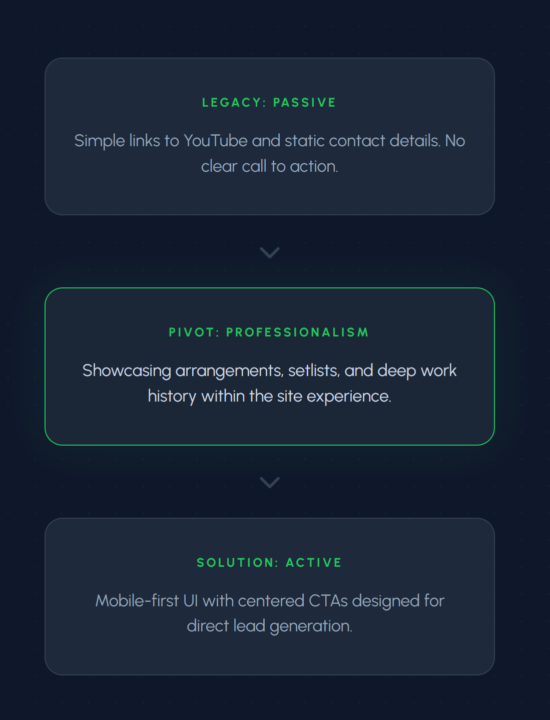
The original website served only as a passive directory that offered basic contact info and a simple link to a YouTube channel. This provided little professional legitimacy for high-value bookings.
I reframed the digital strategy to prioritize active conversion. By showcasing band arrangements, song setlists, and high-fidelity galleries in a mobile-responsive environment, we moved the value proposition from "watch a video" to "book now."
By placing the primary Call to Action (CTA) front and center, we a revenue stream that was previously nonexistent.
Key decisions included:
Treating each band configuration as a distinct offering
Designing a mobile-first grid to surface examples quickly
Separating booking-focused content from deeper exploration
Making the setlist easy to update without site maintenance
The Outcome
Client Confidence
The final product was more than a cosmetic update; it was a psychological shift. By providing a platform that resonated with the client’s talent level we established a new baseline for professional legitimacy.
This high-fidelity environment gave the client the confidence to aggressively pursue new industry partnerships. The "systems-first" approach removed the hesitation previously caused by a fragmented digital presence, leading to a direct increase in professional stature and a sustained growth trajectory.
Live site: stephenscaccia.com
15+
"Having a site that finally matches the quality of my work has completely changed how I approach outreach. I now feel empowered to pitch my band, knowing my digital presence backs me up 100%."
NEW CLIENT BOOKINGS
Next Project