Wayfair Retail Maps
Standardizing a fragmented mapping process into a scalable system for Wayfair’s first flagship store.
Quick Summary
The Problem: Store teams were relying on inconsistent maps that didn’t match the physical space. Associates had to stop, re-orient themselves, and cross-reference information before placing products, slowing down execution during a time-critical launch.
The Fix: I built a standardized mapping system in Google Slides that locked the visual rotation to the store’s main entrance and synced with live inventory data.
The Result: Developed a standardized mapping system used by hundreds of employees for navigation and product placement during the launch of Wayfair's first retail flagship in Chicago.
Role: Retail Map Designer / Visual Systems
Tools: Adobe InDesign, Google Slides, Figma
Timeline: 6 months
Context: Physical retail, live store environment
Phase 1: Shipping what works (Google Slides)
With no engineering bandwidth before launch, I needed a system that could be deployed immediately and updated by non-technical teams. Instead of waiting, I built a scalable mapping system using Google Slides.
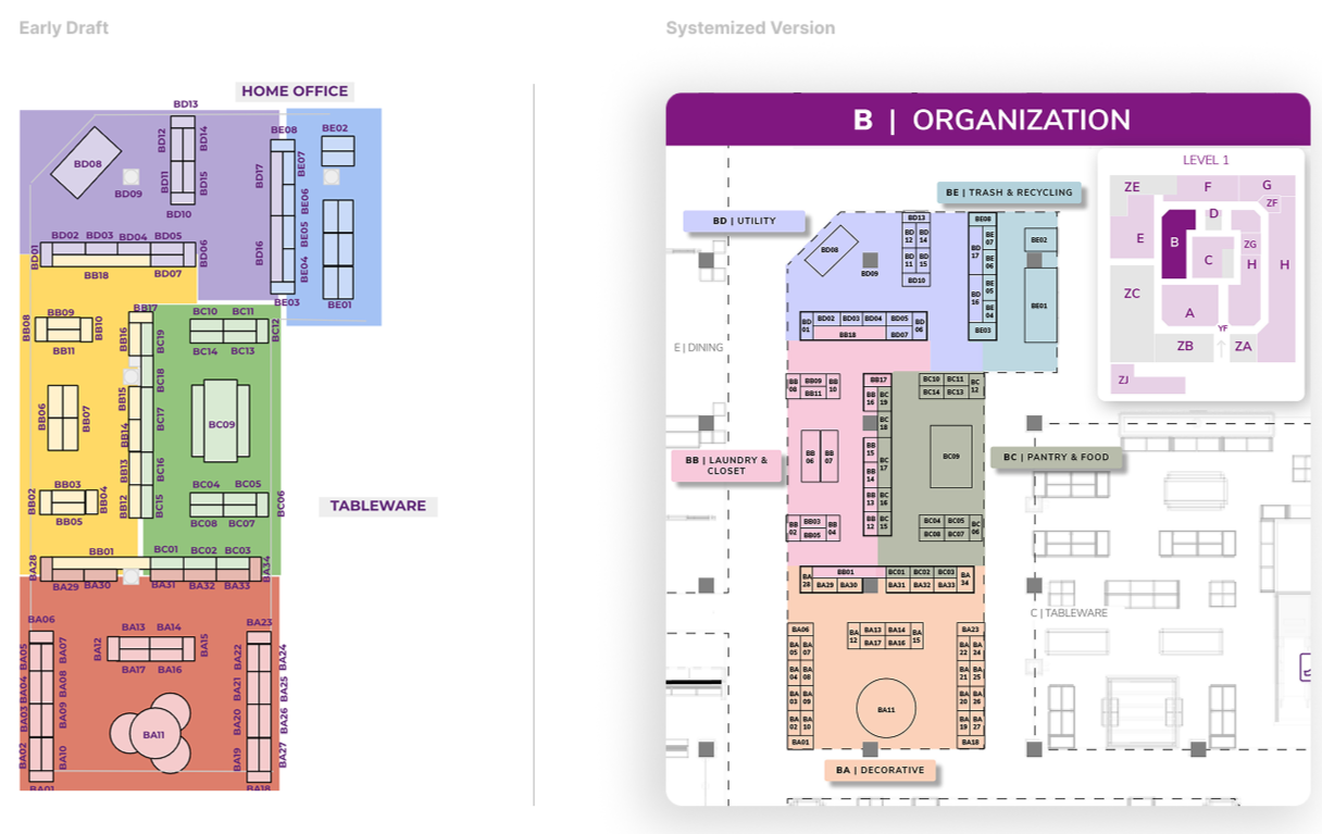
I overhauled the maps to include landmark context like surrounding departments. To make the maps scalable, I established three core system rules:
Department Locator Keys: A mini-map on every slide to show exactly where the associate was standing in relation to the rest of the store.
Predefined Color Styles: A consistent color language that supported rapid, error-safe updates as the layout changed.
Standardized Labeling: Clear, uniform naming conventions across the entire store to ensure every team was speaking the same language.
Together, these rules made the system fast to update, easy to understand, and reliable under constant change.
Most importantly, I locked the visual orientation of every map to match the exact perspective an associate has when walking in from the main entrance. By matching the digital tool to their physical reality, we removed the orientation friction that was slowing the team down.
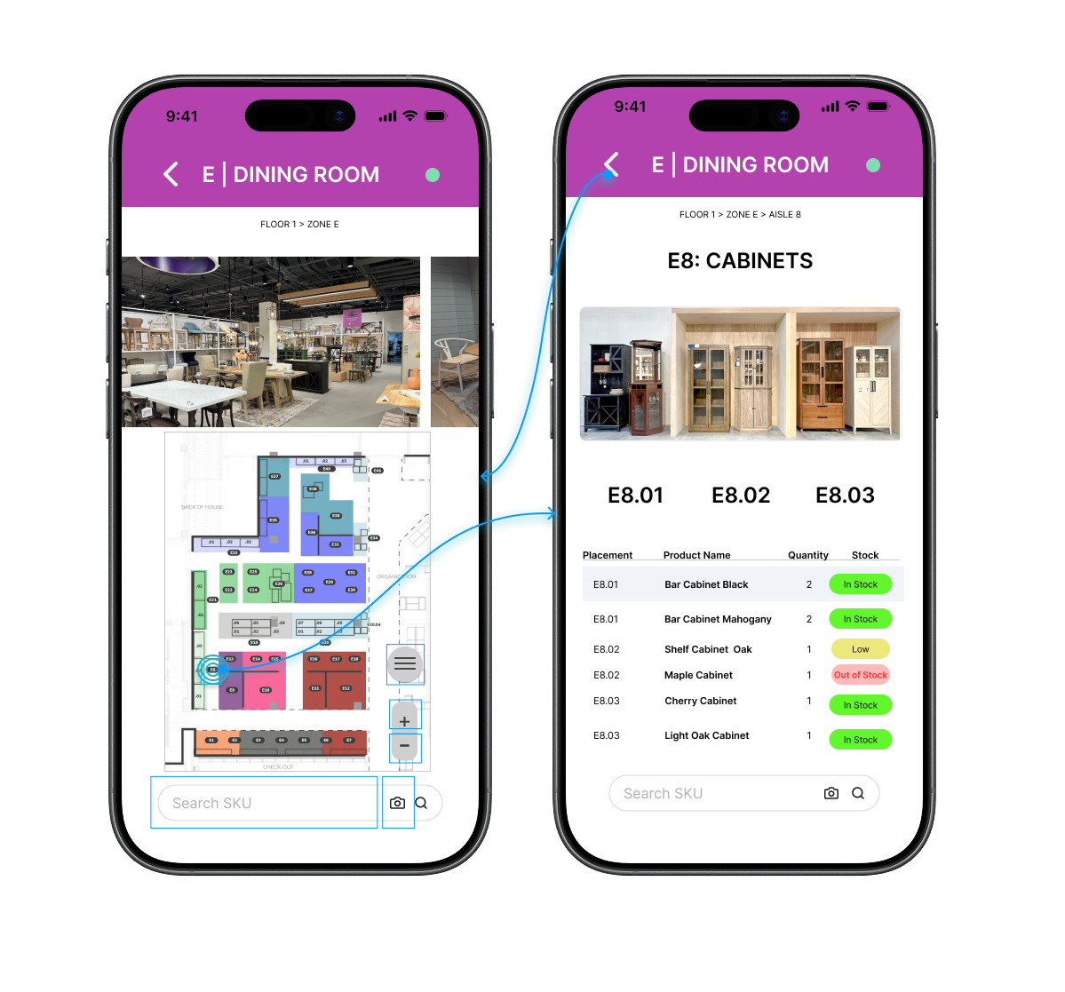
Prototype demonstrating live inventory integration and scalable layout behavior
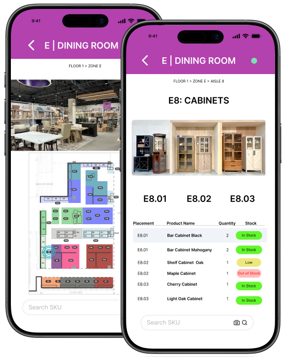
Phase 2: Building the Future Vision
Once the immediate system was stable, I created a high-fidelity prototype to align leadership on what a native tool could unlock.
Live Inventory: Tapping a zone surfaces exactly what should be on the shelf.
Status Badges: Simple color-coded badges show "In Stock" or "Low" status at a glance.
Operational Accuracy: This prototype secured buy-in for future native development by proving how much faster a team can move when they don't have to cross-reference multiple documents.
This wasn’t just a design exercise. It helped shift the conversation from maintaining maps to building a connected operational tool.
Designing for Real-World Data & Handoff
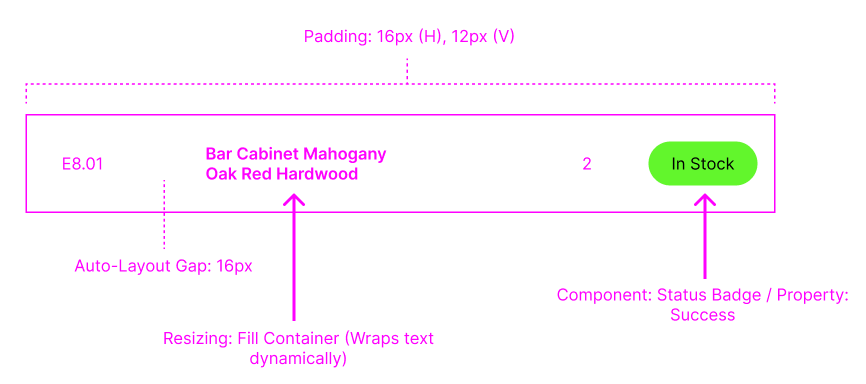
To make this system scalable beyond static maps, I designed the interface to behave predictably under real data conditions and support clean engineering handoff.
To make this system scale to 150,000 square feet, the UI had to be modular. I built the interface using structured layout rules so that variable data like product names, quantities, and statuses could scale without breaking the UI. This made it easier for engineering to map real inventory data into the system without introducing inconsistencies.
Outcome & Impact
By the end of the project, the standardized mapping system supported a massive and complex retail environment. By focusing on how the store team actually worked rather than just making a pretty map, we established a primary navigation and execution system for the grand opening.
28 maps
Each representing a unique layout with operational dependencies.26 departments
managed through a consistent visual language.1,200+ individual placements
verified and executed.Scaled adoption Established as the primary tool used by hundreds of employees pre and post-launch.
What started as a stopgap solution became the foundation for how the team navigates and executes in-store. By designing for the real environment, not just the interface, the system scaled beyond launch and into ongoing operations. Most importantly, associates no longer had to stop and orient themselves. The tool matched how they moved through the store, allowing them to focus on execution instead of navigation.
Next Project
Website UX Redesign
From Zero Baseline to 15+ Direct Bookings